Una mostra virtuale dedicata all'artista grafico e illustratore americano John Alcorn, realizzata per il Centro Apice dell'Università degli Studi di Milano
books, book covers, coners, book jackets, publishing, alcorn, graphic, illustration
As he started to work freelance in 1956, Alcorn stood out as a graphic designer and illustrator for the numerous book jackets he created for several leading East Coast publishers. Through his very first drafts, one notices the development of a very personal figurative language which, however, has its roots firmly planted in the abstract solutions learned at school, adapted to produce figurative effects which alluded to the books’ content.
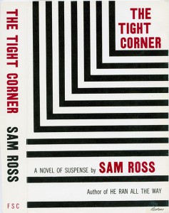
This was the case of The Tight Corner, the story of the dramatic pursuit of a boxer, depicted through the reiteration of a black line reminiscent of the boxing ring, the corner of which is referred to in the title. Abstract shapes, which appear only in his early book jackets prior to 1960, are always used in terms of symbolic representation, as for the essay on aesthetics Sight & Insight.
Later, Alcorn gradually introduced a more illustrative sensibility, first explored during his time at the Push Pin Studios. The Push Pin influence can be seen in his increasing use of illustration in close conjunction with typography, as demonstrated by Bitter Lemons and by his work for Dutton Paperbacks in general.
On various book jackets also appears that minute detail that was typical of his works in the early Sixties. In particular, those for two titles published by Simon & Schuster, for which we can see the rare original drawings: I Love Galesburg In The Springtime and Erasmus With Freckles.
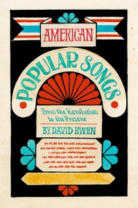
Some book jackets featuring typography alone were ahead of their time and telling of the future direction Alcorn would take. One of the most original is that for A Life After Death, with a chromatic alternation in the characters and background. Moreover, as early as 1964 Alcorn was also being acclaimed for his innovative use of typography.
From the mid- Sixties, coinciding with his growing experimentation with painting, his book jackets became stylistically bolder and increasingly distinctive. But it was his first summer trips to Italy, from 1969 onwards, that expanded exponentially his vocabulary as a draftsman, and led to breakthroughs in his eloquent use of chiaroscuro, as well an increasingly skillful and inventive calibration of text and image. The experimentation continued in Italy, in particular with the Rizzoli revolution.