John Alcorn | Lettering
Una mostra virtuale dedicata all'artista grafico e illustratore americano John Alcorn, realizzata per il Centro Apice dell'Università degli Studi di Milano
lettering, letters, books, book covers, design, typography, alcorn
23209
page,page-id-23209,page-child,parent-pageid-23104,page-template-default,ajax_updown_fade,page_not_loaded,,select-theme-ver-2.4,wpb-js-composer js-comp-ver-4.3.4,vc_responsive

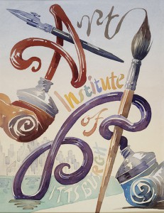
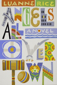
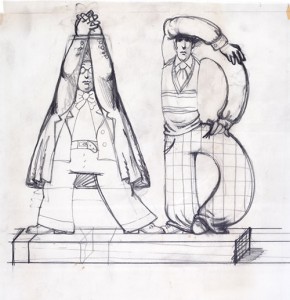
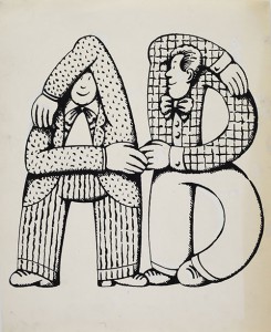
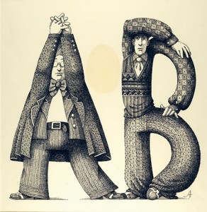
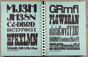
Throughout his career, Alcorn showed a fruitful sensibility towards typography and designed a large amount of letters and numbers. Starting with simple lettering, he then expanded his formal language and let his creativity interpret the alphabet producing diverse shapes. The archive material includes a number of preparatory drawings and sketches on pencil and ink, which testify the long and captivating work behind the final version of a writing.

In a time where graphic designers didn’t use computers, creating a typographic style meant making a lot of drafts and as soon as a final version was reached, cutting out the letters with scissors and pasting them in sequence to form words.

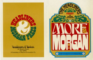
We can trace back Alcorn’s interest in typography to his experience at the Push Pin Studios, but it was in the following years that he perfected his style. Above all, his sensibility was simultaneously refined and put to the test by his works for the Morgan Press, whose collection of rare nineteenth-century American wooden typographic characters – gathered from the 1950s onwards by Douglas and Lloyd Morgan – was to make a significant contribution to the eclecticism of visual trends in the Sixties.

It was Alcorn who designed the covers and interiors of various Morgan Press catalogues from 1963 on, namely Wood and Wood 2, as well as two illustrated catalogues in 1964 and 1968: the former experimented with Victorian-style decorative variations, while the latter outlined a style which was closer to the visual taste of the 1960s, of which Alcorn himself was one of the originators.

Alcorn’s particular feel for typography was expressed exceptionally well on several American book jackets from the 1980s in which, using color alone, he achieved a consummate figurative illustration of the titles, such as in Oh! and Hell’s Bells, where the titles stand out dynamically thanks to the total integration of word and image. Similarly, Alcorn created solutions in which the title is shown using text which appears animated or objectively tangible: for example, on the unpublished covers designed for Helen Elsenbach and Luanne Rice.

Alcorn’s inventive talent with a kind of lettering that becomes immediately communicative is even more obvious in some of his advertising images. On the cover of the Chase banking magazine, the businessman’s shoe is bent to form the pound sign, while on the cover for D&B Reports, a contrast between the half-light of a bedroom and the typographic patchwork printed on a quilt immediately conjures up – in line with the commercial message – the support given by the bank to the couple’s financial needs.

For images in which the message is less important, Alcorn turned to an increasingly free, playful style – as in the case of the Celesta paper promotion – conceiving shapes that could almost generate new words in ever-surprising combinations. Alcorn’s virtuosity in bringing letterforms and numerals to life is further evidenced by his contributions to TV Guide inserts and in one of many volumes he illustrated for Judith Viorst.