Una mostra virtuale dedicata all'artista grafico e illustratore americano John Alcorn, realizzata per il Centro Apice dell'Università degli Studi di Milano
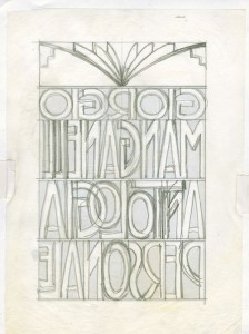
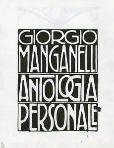
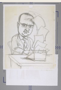
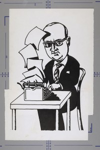
Although Alcorn’s routine was mainly on very close deadlines, his approach to work was never hasty. Thanks to the rich archive material, it’s possible to trace some of the working phases that he went through. First draft on pencil, second, third and more drafts up until the final version.
The main reason Alcorn made so many sketches to reach the ultimate version of every assignment is the relation with the clients. As most of his works were on commission, his success relied on the client’s satisfaction. A number of correspondences testify how complex could be the interpretation of client’s thoughts and the gratification of their taste.
The key in Alcorn’s work was his perfectionism, which permitted him to imagine different points of view and anticipate any objections creating a variety of carefully tailored solutions. In fact, as he believed in the notion of progress in art, he was his own worst critic and was rarely satisfied with his production. This drove him to go above and beyond the requirements of a given assignment, and to execute several equally ambitious alternative versions of an image.
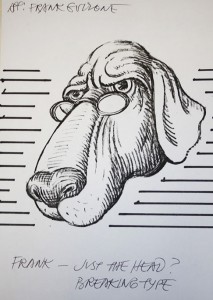
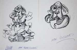
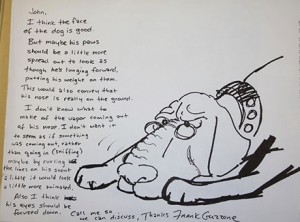
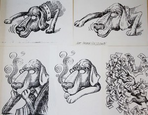
The contrast between the preparatory studies Alcorn made for the advertisement for Agnotti Thomas Hedges, and the final, published piece, illustrates the creative demands and constraints often imposed on him as a commercial artist. A large heap of the preparatory drawing has survived bearing a series of notations, courtesy of the art director: “the dog’s face is ok”, the paws could be more spread out”, “the eyes should be focused down” etc.
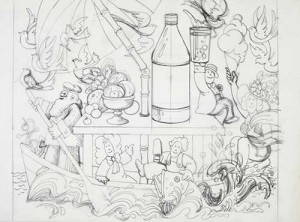
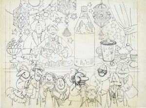
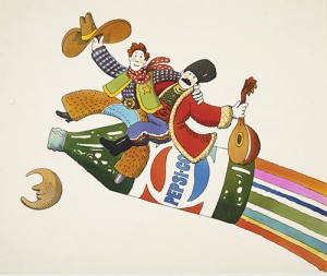
The numerous preparatory sketches for Pepsi show a model Italian family portrayed in a variety of typical situations. The work was delicate and particularly appealing for Alcorn because at the time, Pepsi was a new kind of drink in Italy, and as such was eager to break into a very traditionalist market, one that featured deep-rooted, age-old eating habits in which old social rituals mixed with newer ones.
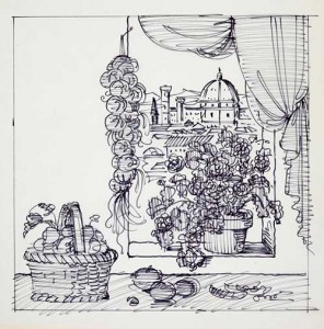
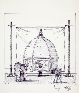
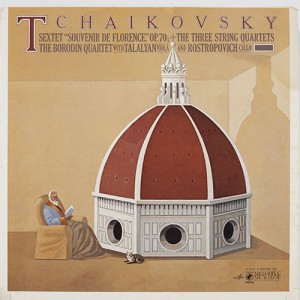
From the preparatory sketches for some record sleeves that Alcorn realized for CBS at the end of the Seventies, one can get an intriguing example of his sensibility to adapt his works to the context. The record sleeve of Tchaikovsky’s Souvenir de Florence features a fresh view of Brunelleschi’s dome, that becomes bigger and bigger from the first draft to the ultimate version. For the American public, the first solution would have perhaps been too esoteric, as that iconic symbol of Florence would not be as familiar to them as it was to Alcorn, and so, in the subsequent design and on the final sleeve, the cupola of the duomo increases in scale to the point of overwhelming the intimate scale of the space in which it was situated.