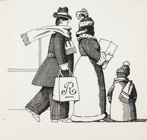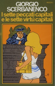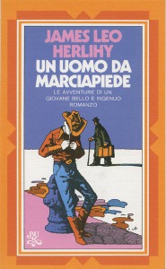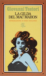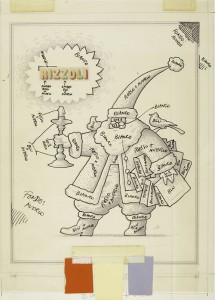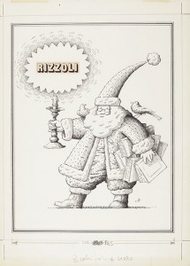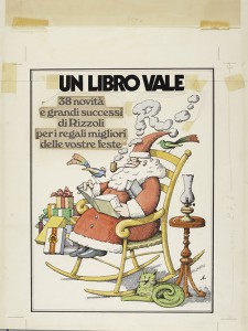
When Alcorn came to work for the Italian publishing house Rizzoli in 1973, he was asked to restyle the presentation of its paperback collection. Enlisted by Mario Spagnol, whom he had met the previous year at Mondadori, Alcorn had exactly what it took for this challenging assignment. Not only was he a well-established professional designer and illustrator, but with his personal brand of the Push Pin Style, which was then considered at the cutting edge of commercial communication, he represented something that was totally new for Italy.
As for Alcorn, the chance to completely redesign one of Italy’s main publishing brands, in tune with Spagnol’s own fine visual taste and passion for figurative arts, was the ideal commission.
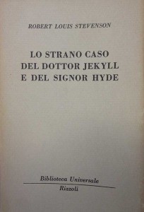
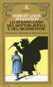
The Rizzoli books which he was about to transform were then published in two main versions: the identical grey, monochrome covers of the Rizzoli’s original affordable series BUR (Biblioteca Universale Rizzoli), launched in 1949 and suspended in the 1960s, and the hardback editions featuring graphics by Mario Dagrada. Entrusting Alcorn with the task did not just mean sweeping away the previous solutions: it was a total overhaul, in contrast to the most sober Italian design tradition.